
VA Sexual Harassment Reporting
Project Background
The Department of Veterans Affairs (VA) is strengthening its commitment to prevent sexual harassment and enhance safety across its facilities. VA is developing mobile applications to enable veterans and visitors to report harassment incidents securely and efficiently.
This initiative aims to prevent harassment, enhance accountability, monitor incidents, and meet congressional requirements. [1]
My Role
In collaboration with Chakakhon Lea from the Office of Veterans Experience, a fellow User-Centered Design graduate student at Brandeis University, I led the following project components:
- UX Research
- UX Design Concept
- Prototyping
- Usability Testing
Duration: Apr – June 2022
Team Size: 2


Design Process

Key Findings from Interviews
Where to Report?
A VA employee didn’t know where to report if she was sexually harassed. She didn’t know where the patient advocate offices are within the facility.
Reluctance to Report
A participant didn’t want to report unless she was assaulted like someone touched or grabbed a body part.
Reporting Preference
There was a mixed preference between reporting in person and reporting with a mobile or web-based form.
Mobile App
A participant preferred an app because it would allow her to report at her leisure when she’s ready and feels safe.
Proof of Filed Report
Participants wanted a copy of their report and the incident number.
Confirmation Call
Participants wanted a confirmation call from someone acknowledging it has been received and the case is in progress.
Retelling the Story
A participant mentioned she does not want to retell and relive her story again and again. So she would like proof of what she submitted so that she can submit it again if she needs to.
Have you or your friend ever been harassed at VA?
"I get catcalls all the time."

Defining the Design Problem
Based on our findings participants either preferred in-person reporting or mobile form reporting. So we formed a “How Might We” question to anchor the ideation session.
How might we help anyone report sexual harassment incidents that occurred at a VA facility?
-
In-person
-
Mobile based form
Ideation
Divergent Thinking Approaches Utilized
- Ideation Workshop
- Scenario Mapping
- Sketching
- Storyboarding


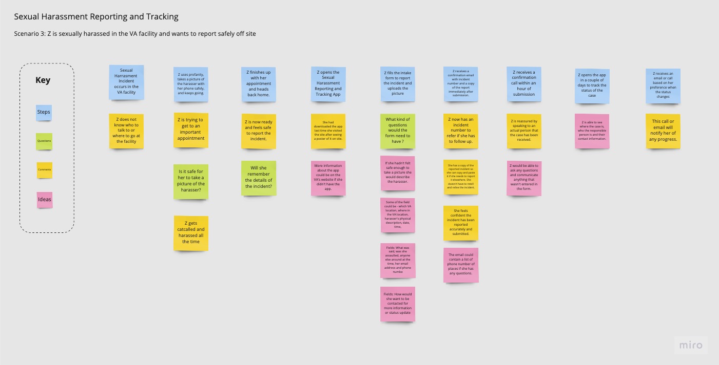


Ideation Process Highlights
Iterative Prototyping
The prototype evolved through three iterations, each with increasing functional fidelity.
- Paper prototypes were tested using the Wizard of Oz method.
- Low-fidelity prototype
- High functional fidelity prototype
Paper Prototype
- Questions of age and sex in the form were thought to be irrelevant in reporting context.
- A participant mentioned she would have liked to have the option to pick the method of contact.
- A participant wanted to see the incident description section next to where she mentioned the date and time of the incident rather than on a different mobile screen, later in the process.
- A participant was confused by the “X” button as it was not consistently placed on different screens. Similarly, the back button wasn’t present on all screens.
- A participant was confused about two text fields for description and couldn’t distinguish between harasser and incident description.
- A participant liked the audio recording feature and also liked being able to use both text and audio for description.
- A participant wasn’t sure if she could re-record the audio.
- A participant would have liked to see a review page before submitting her information.
- A participant wanted to see the timestamp of when the confirmation email was sent to her under the “Tracking Case Status” screen.
• Information architecture was reviewed and changed for the “Incident Description” section.
• Age and sex fields were removed.
• The option to pick the method of contact was added.
• The harasser and incident description was more clearly separated by using section headers.
• A review screen was added before submission.
• The “X” buttons and back buttons were placed consistently on all screens.

Low-Fidelity Prototype
- A participant was confused about what the next and back arrow buttons would do.
- After the submission participant expected to see when someone would contact her.
- A participant expected the system to ask for her incident number in the track case status screen before seeing the status.
- A participant was confused about why there were two text fields for description.
• Labels for the next and back arrow buttons were added.
• After submission, the timeframe was displayed on when the user would be contacted.
• To track the case, the participant was required to enter the incident number in case a user would have multiple incidents reported.
• Shaded backgrounds were added to the harasser’s description and incident description to clearly separate the sections.


Final Iteration
Reason of use
I made updates to conduct detailed testing of features and functions for “Report an Incident” and “Track Case Status” user flows.
- In the record audio screen, the participants while recording, expected to see the play, pause, and trash options along with the pause.
- A participant was happy to see the confirmation of the recording uploaded but wanted to see an “X” button to exit. The green check icon wasn’t intuitive for her to click to go to the next screen.
- In the “Time of Incident” field participant mentioned in an actual scenario, she might not have clear memory and would want to see an “Approximate Time” label instead.
- A participant was confused about what to enter in the “Location of the Incident” field.
- Both participants noticed the uploaded photo attached right away.
- Both participants mentioned they wouldn’t use the record a video option.
- A participant mentioned it would be good to know the time limit if there is one. She also mentioned the time limit would make her nervous and encourage her to rush.
- A participant mentioned if she wanted to re-record, she would like to have the option to record a new one or overwrite parts of the current one, before trashing it.
- A participant was surprised when she saw the “recording uploaded” message after selecting the next button. She expected it to take her back to the form.
- A participant thought it would be a nerve-wracking process to report a sexual harassment incident and she wouldn’t want surprises.
- “It would be a nerve-wracking process to report a sexual harassment incident and I wouldn’t want surprises while filling out the form.”
• The label for “Time of incident” changed to “Approximate Time of Incident
• The label for “Location of Incident” changed to “VA Facility Location”
• Play, pause, and trash buttons were added to the “Record Audio” screen.


Annotated Screens
Reason of use
I annotated the screens to enhance viewer understanding during my absence. I included clear explanations of elements, functionality, and purpose in the document.


Result
This project introduced innovative features not previously explored by VA’s Design Consultants, including voice-based incident reporting. Using a user-centered design approach, we created simple and intuitive solutions focused on user needs.
Future Work
- Conduct further prototype testing using various scenarios with a diverse group of users to evaluate the usefulness of features such as video recording.
- Ensure design consistency and predictability to minimize user surprises, considering their potential stress due to harassment incident.


References